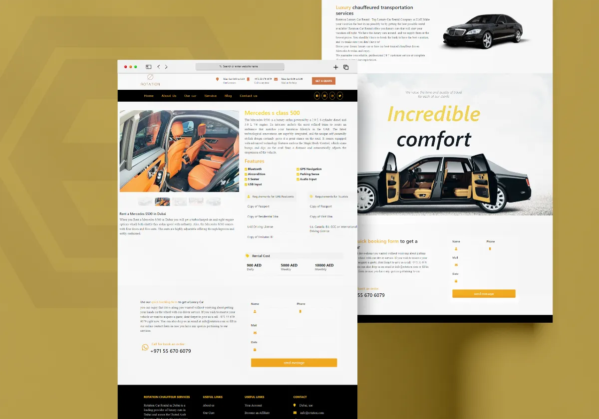
A website can look excellent and still fail to bring results. People may visit your pages, read your content, and leave without contacting you, making a booking, requesting a quotation, or buying anything.
Conversion-focused web design is about reducing that gap. The goal is to make it easier for visitors to understand your offer, trust your business, and take the next useful step.
This does not mean filling every page with large buttons or aggressive sales messages. Good conversion design feels natural. It helps people find the right information at the right time and makes the next step clear when they are ready.
What Is Conversion Focused Web Design?
A conversion is simply an action that matters to your business. It could be a customer sending an enquiry, calling your company, requesting a quote, booking a service, creating an account, downloading something, or completing a purchase.
Conversion-focused design builds the website around these actions. Instead of designing each page only for appearance, you think about what the visitor needs to understand before they can confidently take the next step.
Enquiries
Make it simple for potential customers to ask questions, request information, or start a conversation with your business.
Phone Calls
Give visitors an obvious way to call when speaking directly with your business is the easiest next step.
Bookings
Guide visitors toward booking a service, appointment, consultation, or other available option.
Purchases
Create a clear buying journey that helps customers understand products and complete their purchase without unnecessary steps.
Start With the Visitor
The first step is understanding what someone wants when they arrive on a page. A visitor who searches for a specific service usually does not want to read a long introduction about the company before finding the answer they came for.
Give people the information they need early, then provide more detail for visitors who want to learn more.
A good page answers the important questions naturally: What is this? Is it suitable for me? Why should I choose this company? What happens next? How can I get started?
Make the Main Message Clear
Your visitor should understand what the page is about without having to work it out.
The main heading should clearly explain the service, product, or offer. Supporting text can then explain the value and give the visitor a reason to continue.
A clever headline may look interesting, but a clear headline is often more useful. If someone has to guess what your company does, you have already created unnecessary friction.
Build a Clear Page Structure
Visitors do not normally read every word on a website from top to bottom. They scan headings, images, short paragraphs, buttons, and other visual signals to decide where to focus.
This means the page needs a logical structure. Important information should be easy to find, supporting information should appear where it makes sense, and the visitor should gradually move toward the next action.
A Simple Conversion Page Structure
Clear Introduction
Tell visitors what the page is about and immediately communicate the main value of the service or product.
Useful Information
Explain the important details visitors need before they can decide whether your offer is right for them.
Reasons to Trust You
Use experience, results, testimonials, reviews, certifications, case studies, or other relevant proof.
Clear Next Step
Give visitors a simple and relevant action such as contacting you, requesting a quote, booking, or buying.
Use Calls to Action That Make Sense
A call to action tells visitors what they can do next. The wording should match the situation rather than using the same generic button everywhere.
For example, a service page might use “Request a Quote,” while a consultation page could use “Book a Consultation.” An ecommerce product page might use “Add to Cart,” while a contact page could simply use “Send Enquiry.”
The important thing is that the visitor understands what will happen when they click.
Don't Ask for Too Much Too Early
People are less likely to complete a form when it asks for information they don't feel is necessary.
If you only need a name, email address, phone number, and a short description of the requirement, don't ask for ten additional fields just because they are available.
Long forms can make sense for certain businesses, but every field should have a reason. The easier you make the first interaction, the more comfortable people are likely to feel about contacting you.
Build Trust Before Asking for Action
People are naturally cautious when dealing with a company they don't know. Before they contact you or spend money, they may want to know who you are, what you have done, where you operate, and whether other customers trust you.
This is why trust elements can be an important part of conversion-focused design.
About Your Business
Explain who you are, what you do, and why customers can rely on your business.
Reviews & Testimonials
Real customer feedback can help visitors feel more confident about choosing your business.
Work & Case Studies
Show relevant examples of your previous work so visitors can see what you can actually deliver.
Experience & Credentials
Relevant experience, certifications, partnerships, awards, or industry knowledge can strengthen trust.
Use Content to Answer Questions
Good conversion content does not simply try to persuade people. It helps remove uncertainty.
If customers regularly ask about pricing, delivery, service areas, timelines, requirements, support, returns, or the development process, those questions can become useful website content.
When people can find answers without having to contact you for every basic question, they can make decisions more comfortably.
Keep Navigation Simple
Navigation should help visitors move around the website without distracting them from the main purpose of the page.
Important pages should be easy to reach, and related pages should be connected naturally. If someone is reading about a particular service, it should be easy to find related services, useful guides, contact information, or the next relevant step.
Design for Mobile Users
A conversion-focused website must work properly on mobile devices. Buttons need to be easy to tap, forms need to be comfortable to complete, text needs to be readable, and important information should not disappear into complicated layouts.
A desktop design may look excellent, but if the mobile experience makes it difficult to contact the business or complete a purchase, the design is not doing its job.
Keep the Website Fast
People are less patient with slow websites. A visitor who is ready to contact you may simply leave if the page takes too long to load.
Images should be optimized, unnecessary scripts should be avoided, and animations should be used carefully. Good performance is not only a technical concern; it is part of the overall user experience.
Don't Overdesign the Page
It is tempting to add more animations, more sections, more colors, and more interactive effects when trying to create an impressive website.
But conversion-focused design is usually about clarity. Every section should have a purpose. Every major visual element should help the visitor understand something, trust the business, or move toward a useful action.
If an element does none of these things, it may not need to be there.
Make the Next Step Obvious
Visitors should not have to search for your contact details after deciding they want to speak with you.
Keep the main action visible in appropriate places throughout the journey. A service page can introduce the action after explaining the service, while a longer page may need another opportunity to contact the business near the end.
The goal is not to pressure visitors. It is simply to make the next step available when they are ready.
Measure What Is Working
Once a website is live, you can learn a lot from how people use it. You may discover that visitors are reaching a particular page but rarely completing the form, or that one service page generates considerably more enquiries than another.
This information can help you improve the website instead of relying entirely on assumptions.
Conversion optimization is often an ongoing process. Small changes to content, page structure, forms, calls to action, or navigation can make the experience better over time.
Conversion Design Is Not Just About Buttons
It is easy to think of conversion optimization as simply adding more buttons. In reality, the whole visitor experience contributes to conversion.
The visitor needs to understand the offer, find useful information, trust the business, feel comfortable with the next step, and be able to complete that step without unnecessary difficulty.
When all of these parts work together, the website becomes much more than an online brochure. It becomes a useful part of the business.
A Simple Way to Think About Conversion
You can think about the visitor's journey in a simple way: understand, trust, decide, act.
First, the visitor needs to understand what you offer. Then they need enough information to trust the business. After that, they decide whether your service or product is right for them. Finally, the website should make the action simple.
Understand
Explain clearly what you offer, who it is for, and why it matters.
Trust
Give visitors useful information and genuine reasons to feel confident about your business.
Decide
Answer common questions and remove the uncertainty that can stop someone from moving forward.
Act
Make the final action clear, simple, and easy to complete on any device.
Conversion Focused Design and SEO Work Together
SEO can bring people to your website, while conversion-focused design helps give those visitors a useful experience once they arrive.
That is why it is important to think about both together. A page should be useful enough to attract the right search traffic and clear enough to help those visitors understand what to do next.
The objective is not simply more traffic. It is to attract the right people and give them a good reason to continue.
Build for People First
The most useful conversion-focused websites do not feel like they are constantly trying to sell something. They feel clear, helpful, trustworthy, and easy to use.
When visitors can quickly understand your business, find answers to their questions, see reasons to trust you, and take the next step without confusion, the website is doing its job.
From Conversion Design to the Next Guide
Once your website is designed around useful actions, the next important question is how the same experience works on smaller screens. Mobile users may interact with navigation, content, forms, buttons, and layouts differently from desktop users.
Next guide: Ecommerce Design Guide — how to create a practical and customer-friendly online store.